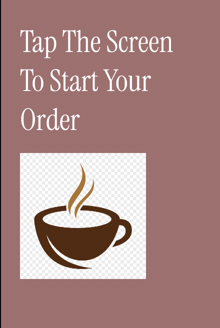
Self-Service Kiosk: Optimizing High-Volume Transactional Flows
Role: UX Designer & Usability Lead
Scope: Interactive Prototype Design & Usability Validation
Overview
High-traffic self-service kiosks often create cognitive overload for users, especially when they have complex drink customization options. The goal of this project was to design a streamlined ordering experience that allowed users to navigate from “Start” to “Pay” in under 60 seconds while minimizing decision fatigue.
Understanding the Problem
Kiosk users frequently experienced “choice paralysis” or fragmented navigation. Sub-menus for customization caused confusion and slowed down transactions. The challenge was balancing speed, accuracy, and usability in a high-volume environment.
My Contribution
I led the design of the interactive prototype and usability validation process:
Mapped the customer journey to understand user states and priorities
Created a logic-first flow: Category Selection → Customization → Upsell/Extras → Order Review → Secure Payment
Employed rapid iteration with low-fidelity paper prototypes to test navigation and mental models
Conducted user testing with frequent kiosk users to validate flows and uncover friction
Key Findings & Pivot
Friction Point: Users felt “trapped” in customization menus without a clear exit path
Solution: Added a universal “Back to Main Menu” anchor and reordered customization steps to match the natural way users describe drinks (Size → Milk → Flavor)
Post-iteration testing confirmed that these changes increased confidence and created a smoother “Take, Pay, and Go” rhythm.
The Solution
The final design was a high-fidelity Figma prototype featuring:
Clear, linear navigation
Responsive transitions and real-time feedback
Large touch targets for quick interaction
Intuitive hierarchy that guides users naturally through the order process
Outcome
User Feedback: Participants rated the final flow as significantly more intuitive and frictionless than initial prototypes
Instructor Recognition: Prototype received top marks for user journey accuracy and intuitive hierarchy
Successfully replicated a real-world ordering experience suitable for high-volume transactional environments
Reflection
This project taught me the importance of designing for speed and clarity in high-pressure environments. Small decisions, like reordering customization steps or adding a single “Back” anchor, can have a major impact on user confidence and flow efficiency.
I also learned the value of rapid prototyping and iterative testing, which allowed me to validate assumptions before committing to high-fidelity design. It reinforced my belief that even complex systems can feel intuitive if the flow aligns with natural user behavior.
Click the link below to access the kiosk prototype: